Mobile banking matters more than ever in the US and Canada: online banking usage is trending down as mobile banking usage and engagement continues to rise. In mobile banking channels, customers demand a widening set of features and services – and these mobile experiences have a major impact on brand perceptions and preferences.
So what is the current state of mobile banking experiences?
To answer this, Forrester conducted our annual Digital Experience Review™ (DXR) to assess the main customer-facing mobile banking apps of 12 major banks in North America: Ally, Bank of America, Bank of Montreal (BMO), Chase, CIBC, Citi, Royal Bank of Canada (RBC), Scotiabank, TD Canada Trust, USAA, U.S. Bank, and Wells Fargo. Here’s a sampling of what we found:
- Too many banks’ apps lack newer must-have and differentiating features. Banks have spent many years (and lots of dollars) to improve mobile experiences for their customers – a trend that accelerated sharply in 2020. As a result, most banks’ apps sufficiently meet customers basic needs. But banking customers today do more, want more, and expect more. Even among the 12 large US and Canadian banks we reviewed, the majority lack most of the emerging must-have and differentiating features we’ve identified in our “What’s Next In Mobile Banking” research. For example, eight banks fail to give mobile users content and tools to help them track and control how their personal financial data is used and shared.
- There are banks that lead in mobile, but none that stand out. US and Canadian banks are struggling to create differentiated mobile experiences that deepen customer relationships and drive engagement and growth. Forrester’s data shows that US banking customers think their primary provider’s app is the same as others’ — and just 36% say their primary provider offers unique value and is different from other banks. Our reviews reveal a widespread lack of differentiation: Even a mobile bank app with useful functionality and strong UX has at least one other large bank in its market with a comparable app.
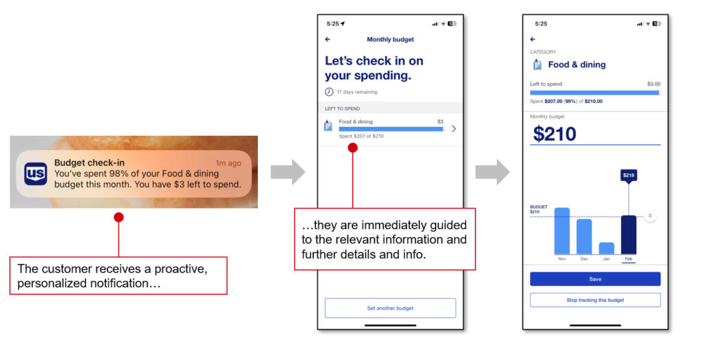
- Bank executives and leaders can learn from others’ best practices. Our reviews didn’t leave us in the doldrums and full of despair, I’m happy to report. We identified more than three dozen best practices that should inspire digital leaders and their teams at banks. For example, Scotiabank and U.S. Bank both demonstrate excellent content designed to help users get the information and take the actions they need to complete their objectives. Ally, BMO, RBC, USAA, and Wells Fargo all offer a wide range of card management capabilities. Bank of America leads in money management with a personalized analysis that overlays current month spending, typical spending, and budget – all delivered via the in-app chatbot Erica and push notifications. U.S. Bank, meanwhile, effectively uses notifications to help customers track budgets (see images below).
But the overall story from this year’s reviews is one of brand stasis in mobile banking.
One last thing: We’ve been doing DXRs for more than a decade and we’ve seen this kind of sufficient-but-undifferentiated parity before: In 2015 we found “No Clear Leader” in US mobile banking. Bank executives and their digital teams should be even more worried (and spurred to action) because there are new competitive threats, and because customer retention is not enough to drive sustained growth – now and for the foreseeable future.
You can read our full “The Forrester Digital Experience Review™: US And Canada Mobile Banking Apps, Q3 2023” report if you are a Forrester client.
In addition, feel free to reach out to us if you want further insight into the best practices we identified in this research. We look forward to talking to you soon!
Note: The underlying evaluative research for this blog post was conducted by Senem Guler Biyikli, Aaron Suiter, David Truog, and Peter Wannemacher
[Image: U.S. Bank Uses A Combination Of Push Notifications And In-App Tools To Help The Customer Track Their Budget]

Source: U.S. Bank’s iPhone app, 2023


